Create a horizontal stacked bar chart with financial data
Source:R/bar_plot_emission_profile_financial.R
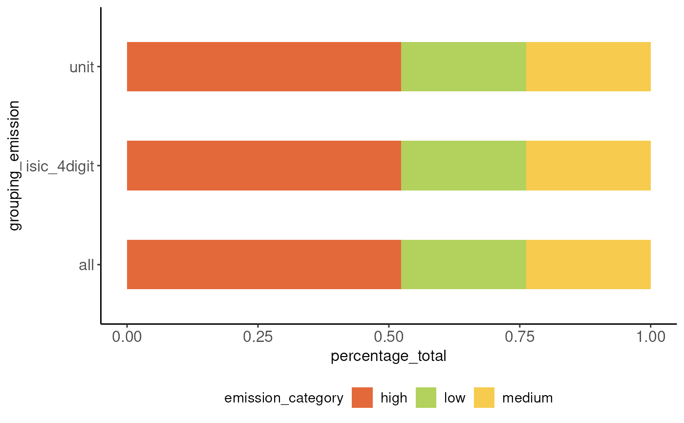
bar_plot_emission_profile_financial.RdGenerate a horizontal stacked bar chart showing the distribution of the emission risk profiles risks for one or several benchmarks.
Usage
bar_plot_emission_profile_financial(
  data,
  grouping_emission = grouping_emission(),
  mode = c("equal_weight", "worst_case", "best_case"),
  risk_category = risk_category()
)
Arguments
- data
A data frame like financial.
- grouping_emission
A character vector specifying the benchmarks for which the emission profiles will be plotted. The user can choose from one to several benchmark(s) to be plotted.
- mode
The mode of financial data to plot. It can be one of "equal_weight", "worst_case" or "best_case". If nothing is chosen, "equal_weight" is the default case.
- risk_category
A character vector.
Value
A ggplot object.
Examples
grouping_emission <- c("all", "unit", "isic_4digit")
bar_plot_emission_profile_financial(financial, grouping_emission,
  "equal_weight",
  risk_category = "emission_category"
)